 Voyager Suite
 Breeze
 Virtuoso
 Investment Suite
 RentCafe Suite
 REACH by RentCafe
 CommercialCafe Suite
 Elevate Suite
 Procure to Pay Suite
  Energy Suite
 Aspire
 RightSource
 Care Suite
 Matrix
 Yardi Kube Suite
 ScreeningWorks Pro
  Yardi Corom
responsive design
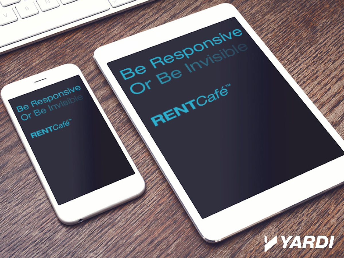
Be Responsive
It’s increasingly apparent that the future of computing is moving from one type of screen – traditional desktop monitors – to many types of screens with a multitude of different sizes and resolutions. But computers themselves aren’t driving this sea change, consumers are. Today’s online renters are using laptops, tablets, phones and even watches to […]
04 / 13 / 15
ENERGIZED FOR TOMORROW
We’re here to help
Do more with innovative Property Management Software and services for any size business, in every real estate market.
Sorry, this video is unavailable as it is not hosted by Yardi Systems.