 Voyager Suite
 Breeze
 Virtuoso
 Investment Suite
 RentCafe Suite
 REACH by RentCafe
 CommercialCafe Suite
 Elevate Suite
 Procure to Pay Suite
  Energy Suite
 Aspire
 RightSource
 Care Suite
 Matrix
 ScreeningWorks Pro
  CommercialEdge Suite
  Yardi Kube Suite
 Yardi Corom
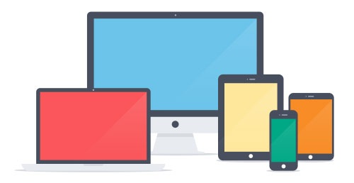
Responsive Design
All Platforms, All Users
It’s becoming increasingly apparent that the future of computing is moving from one type of screen – traditional computer monitors – to many types of screens with a plethora of different sizes and resolutions. Smartphone and tablet sales are outpacing PCs, and innovative web-browsing technologies, like Google Glass and the iWatch, appear to be on […]