If your pay-per-click (PPC) campaign leads prospects to your home page, you’re missing out on conversions. Creating a landing page for your paid ads is a proven way to increase your conversion rate.
What is a landing page?
A landing page is not built into your website through the navigation menu. It is a stand-alone page that prospects land on after clicking your paid ad. The sole purpose of a landing page is to get your prospects to take action.
The landing page should provide a quick summary of what you have to offer. It should then direct the prospect on how to take advantage of the offer (the conversion).
That’s it.
Why are landing pages so powerful?
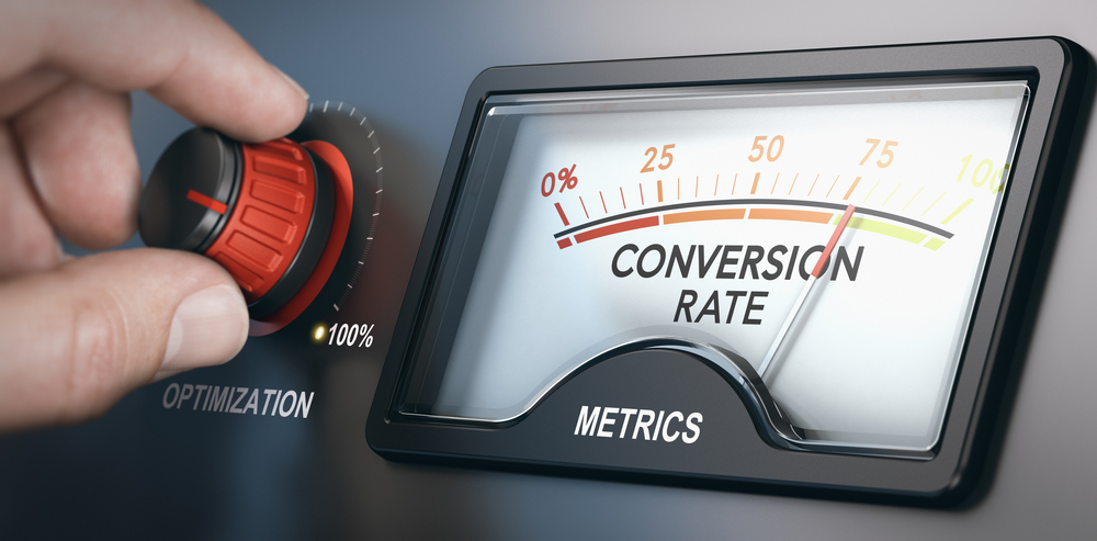
Organizations that use landing pages experience more conversions. Research reveals that more landing pages lead to more conversions.
Paid ads placed in internet searches, emails, or social media campaigns should guide prospects to a landing page. In fact, landing pages help ads achieve a greater return on investment. They also improve your site’s quality score.
Without a landing page, your cost per lead rises and your conversion rate lowers. You’ll pay more for less business!
What should my landing page include?
Keep your landing page informative yet simple. Landing page essentials include:
Your logo
Quickly reestablish your brand with by placing your logo near the top of the landing page.
A captivating headline
A solid headline does two things. First, it confirms that prospects have arrived to the correct page after clicking your ad. You can achieve this by using the same language in the headline as you did in the ad. Secondly, the headline entices the prospects to read more and take action.
Copy and media that mimics the language of the ad
Your copy should resemble your ad so that prospects know they’re in the right place to receive your offer.
Keep copy short, skimmable, and focused on the benefits of your offer. You may consider bullet points or icons with short descriptions. Both present information in easy-to-consume nuggets.
Visually, there is a science to readability. A line length of 50-75 characters has proven success. Line spacing between 120 percent and 140 percent of the type size is easy on readers’ eyes.
A single, compelling call-to-action (CTA)
There are several components to an effective CTA: the outbound link, the button text, and the button appearance. Each works together to improve your conversion rate.
First, your landing page should only have one goal, one CTA. That goal may connect to one outbound link. If so, this link should connect directly to your offer or thank you page, not a homepage.
The text on your CTA button should convey what your prospect will get for taking the action. It should not tell them what they need to do, or what you’re offering. For example, “click here” or “studio apartments” will be less effective than “reserve your tour.”
Lastly, your CTA button should look like a button. Squares, rectangles, and circles are most easily recognized. Other shapes may confuse prospects. The button should be at least 10 x 10mm so that it is easily clickable on a smartphone. Place the button within the readers’ visual flow. If the button is tucked into the margins or corners, prospects may not notice it.
Striking media
Photos, graphics and videos are all fair game. The latter is growing quickly in power and popularity. Increase your conversion rate by as much as 80 percent by adding a video.
If you opt for a photo or graphic, be sure that the image is the same or similar to the image used in your ad.
Form fields
Forms are how you gather information about your prospects. Name and phone number are the minimum for lead generation for most leasing staff. Perhaps toss in a field for the desired unit size.
The key, though, is to gather the information needed without taking up too much of prospects’ time. Each field requires more effort from the prospect. That added effort is a potential barrier to conversion. You only want to create such a barrier if you intend to restrict the leads generated. In that case, more fields may result in higher quality leads.
There are a few features that your landing page should exclude. Such features increase your cost per lead, wasting your money and your prospects’ time. Learn more in our upcoming post, “Avoid Landing Page Sabotage.”